The Challenge
To create a responsive student networking app for aspiring tech professionals that is based on the user research provided by CareerFoundry.
The Purpose
Tech_Together was a personal solo project that I built in 2021 as part of a 2-month UI specialization course at CareerFoundry to complement my existing UX skillset with a strong foundation in user interface design.
The Goal
A responsive web app that connects aspiring designers and developers to facilitate peer-to-peer learning and cross-disciplinary collaboration. Additionally, I had the personal goal of advancing my UI skills and software knowledge by working with Sketch and Adobe XD, so I could add them to my toolkit and become a more flexible, versatile designer. (For my past projects I had been working in Figma.)
My Process
My process in this project was to take the objective outlined in the course project brief as well as the provided user stories and user persona as basis to create the concept for my app. I then planned how the product would function by creating my user flows before proceeding to the stages of wireframing and prototyping. I finalised the project by transforming my collection of various UI elements into a consistent styleguide.
My Tools
- Pen and paper for low-fidelity wireframing;
- Sketch for mid-fidelity and high-fidelity wireframing;
- Adobe XD for prototyping, interaction design.
1. Define
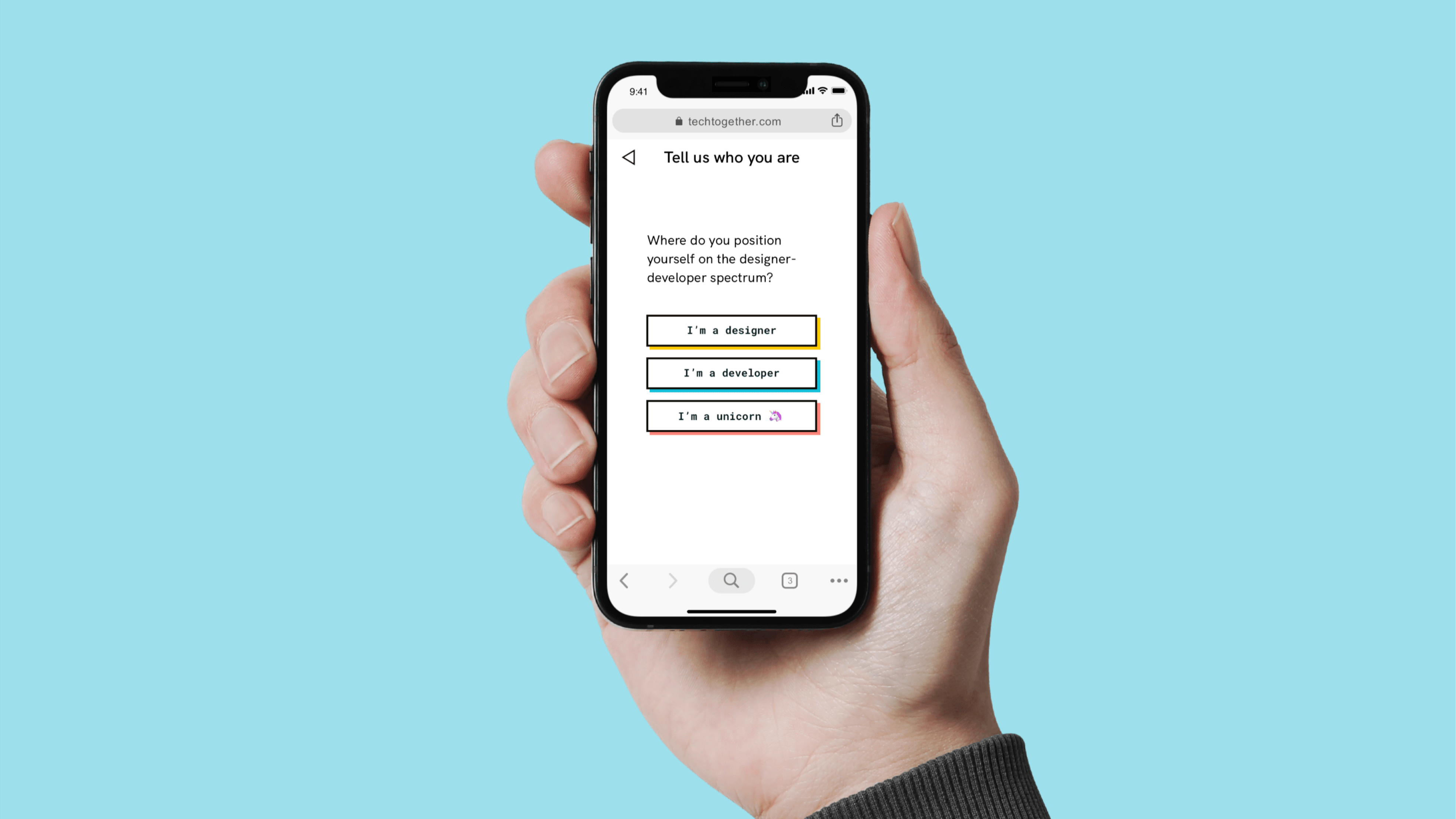
As the focus of this project was UI design, the required research was provided in advance. To make the project less generic – it’s a course project after all – I decided to focus on a more specific target group (aspiring tech professionals instead of just students) and to include three distinct user groups (designers, developers and “unicorns”). I wanted to tackle the challenge of bridging the often reported communication gap between designers and developers by enabling these groups to collaborate with another right from the beginning of their learning journeys. I started out by translating the provided user insights into concrete user flows:

2. Explore
Low-fidelity wireframes were designed with a mobile-first approach. When handling a content-heavy app with multiple user groups, making information on the screen easily digestible while also ensuring that navigation is both versatile and simple is very important. Therefore, an important goal in this stage was to develop ideas on how to make orientation in the app as easy and smooth as possible while providing all content the users need in their respective context.

To inform the styling of my app’s user interface, I created two different moodboards that explored what a coherent brand and design environment could look like:

Under different circumstances, I would have considered testing both concepts with my users. But due to time constraints and UI being the educational focus in this project, I went straight into making a decision. I chose the first moodboard because its projected atmosphere is more playful: It communicates a fun, motivating learning environment which aligns well with the project brief.
Furthermore, its bright colours and unique combinations of angular and round shapes set the tone for a fruitful collaboration. They also inspired me to think about ways the app’s different user groups could be presented visually to enable users to quickly identify which people, groups and projects are best suited for cross-disciplinary exchange and collaboration, while others address the need to exchange with people of a similar background and expertise.
3. Implement
As the fidelity of my screens increased, I dug deeper into the concept of angular-shaped boxes with dark lines that draw immediate attention to the most high level content of the design. I also created a system of shapes and colours to represent the different user groups/main topics of the app.


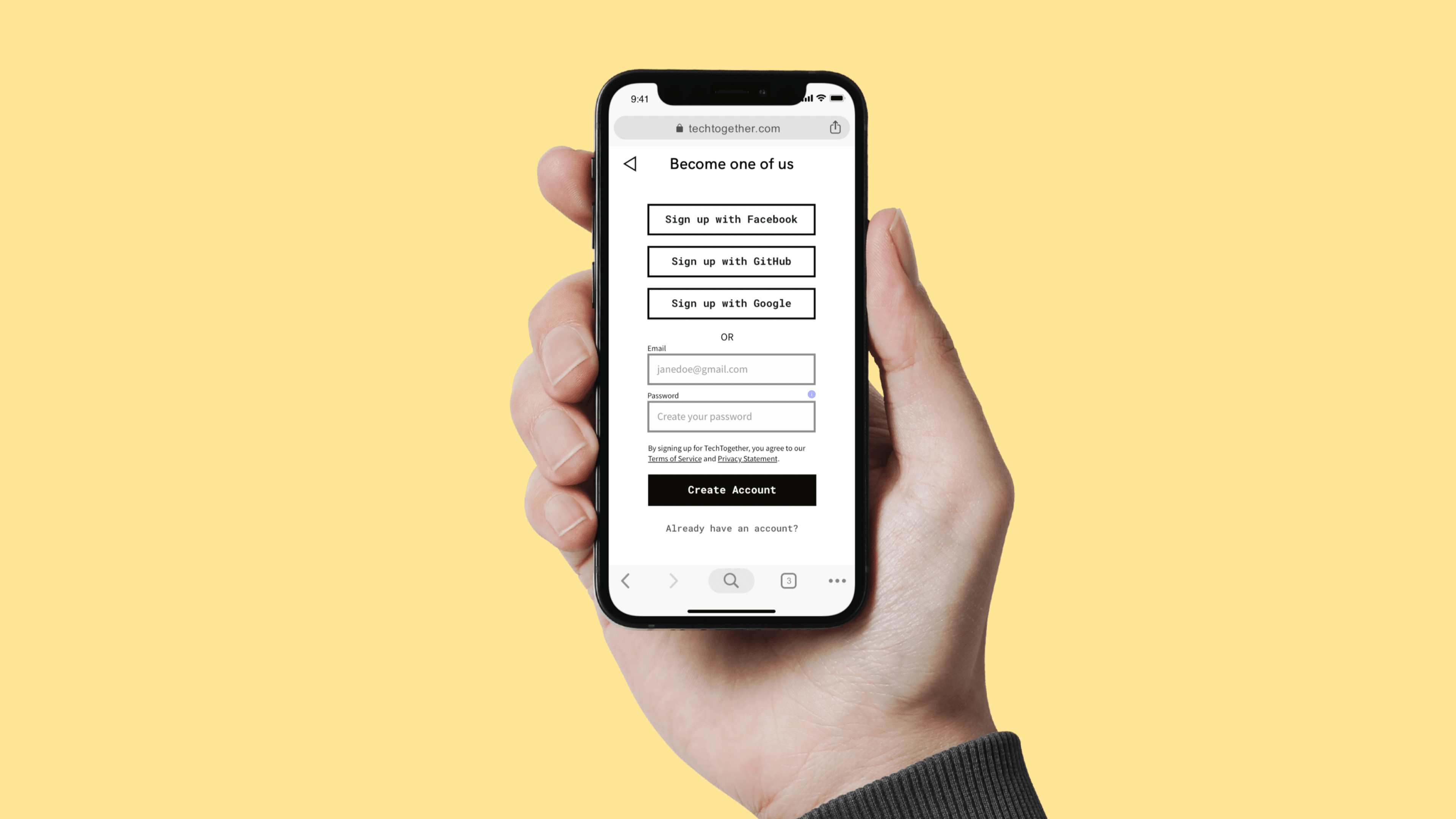
Example screens: 1. Home, 2. Make Connections, 3. Groups, 4. Projects
UI design involves a lot of experimentation. While the angular-shaped boxes with thick, dark lines helped to make high level content stand out and lead the user towards actions deemed most important, these elements proved to be too dominant/distracting on screens that focused on low-level content such as messaging. In cases like these, new elements were introduced (e.g. light-colored, transparent backgrounds).

To make interactions within the mobile version of the web app as easy and intuitive as possible, most of the interactions in Tech_Together consist of tapping, scrolling and swiping:
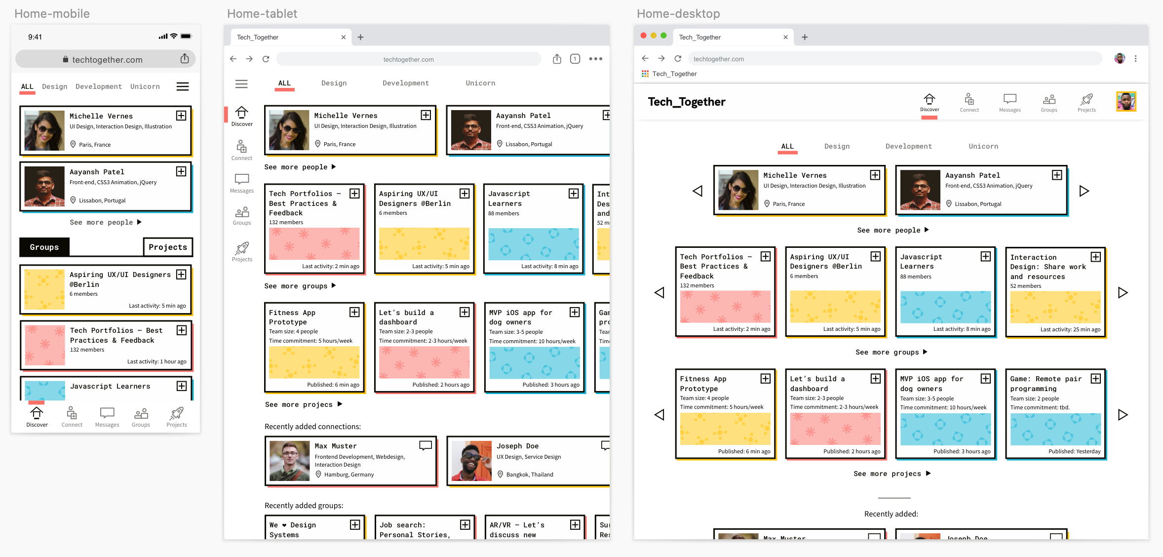
Following a mobile-first approach, I translated my designs to different screens sizes/breakpoints to ensure a seamless experience across various devices:
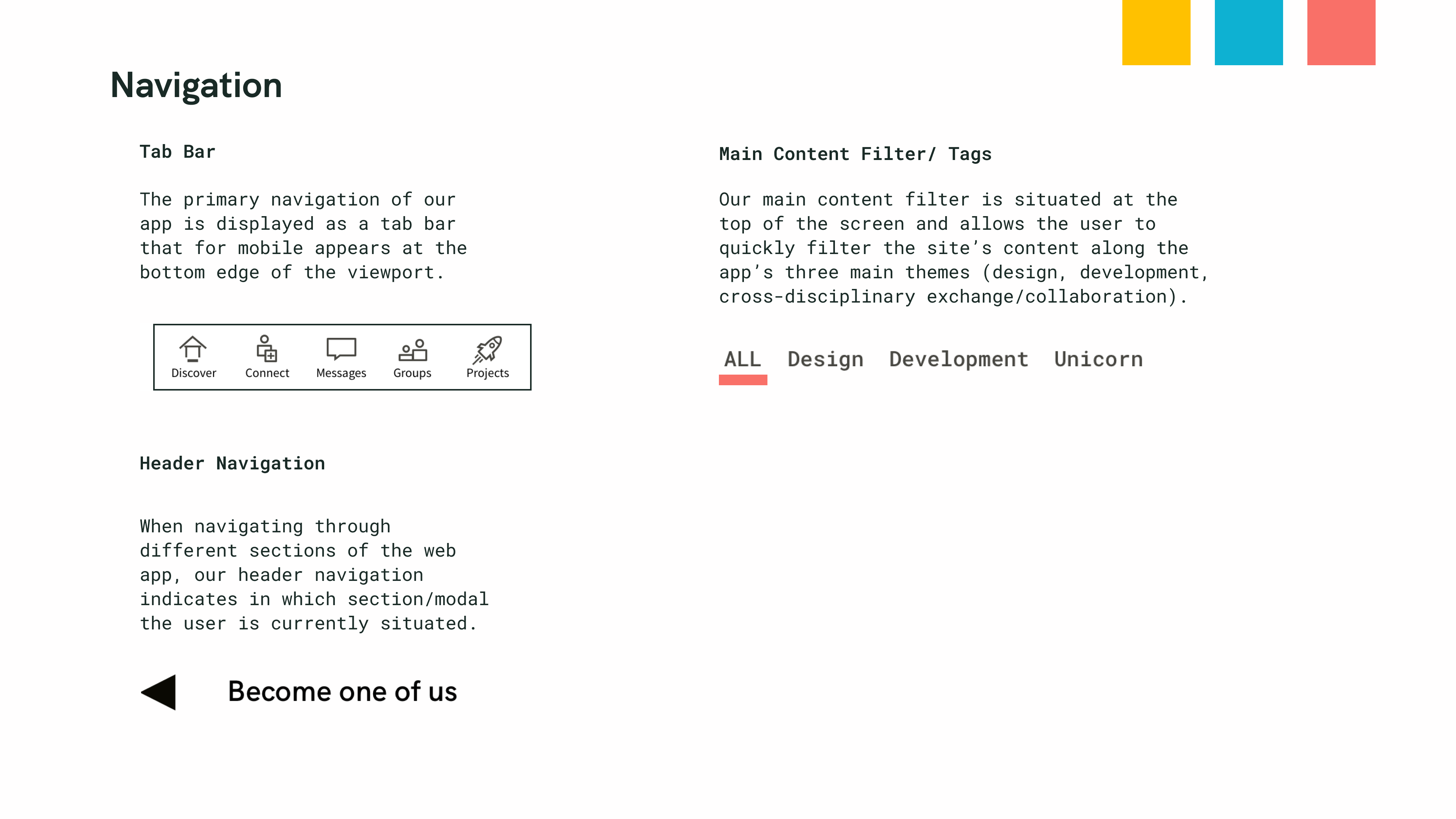
The project was finalised by converting the various elements of my design into a consistent styleguide:



4. Final Design & Retrospective

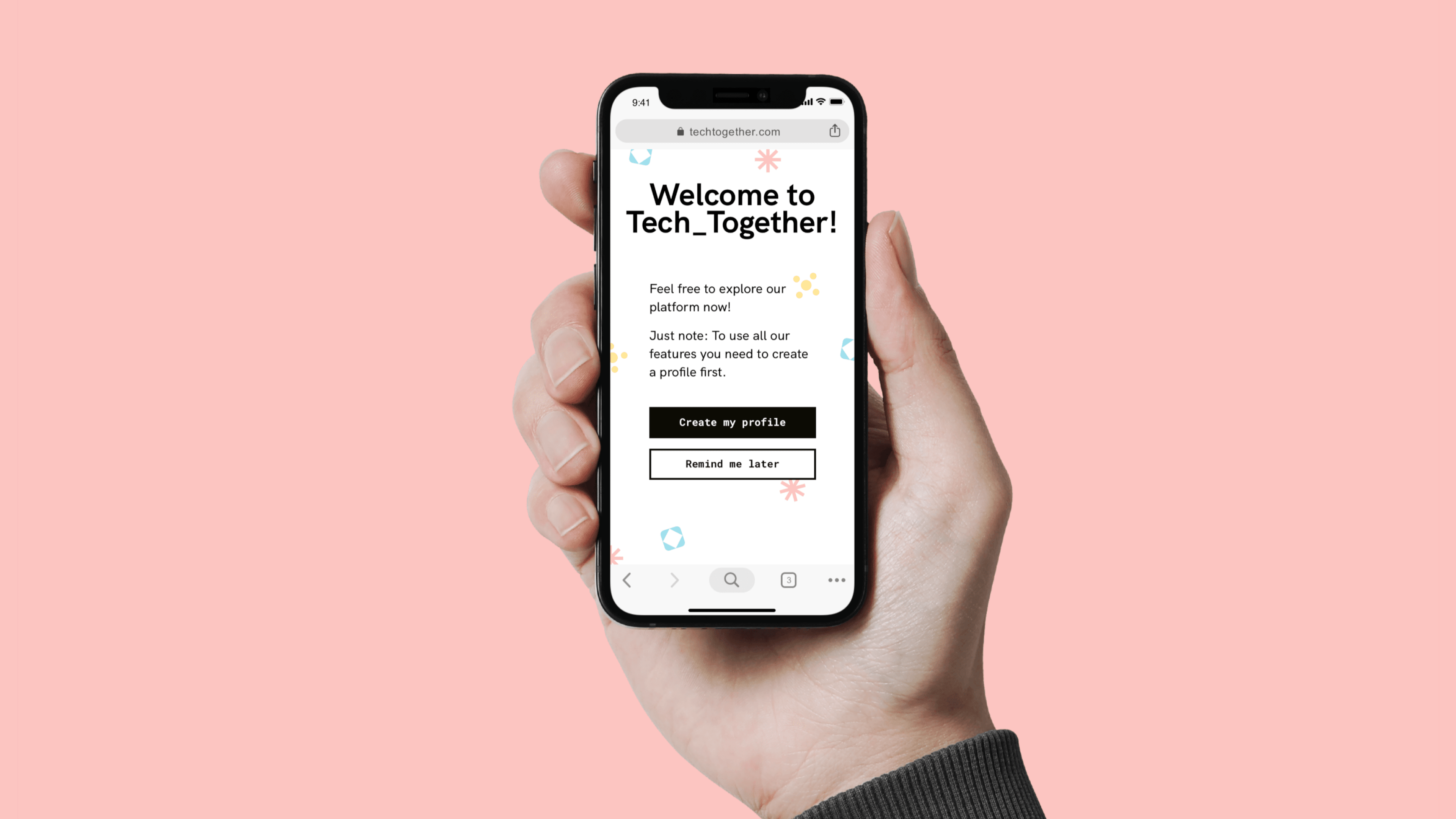


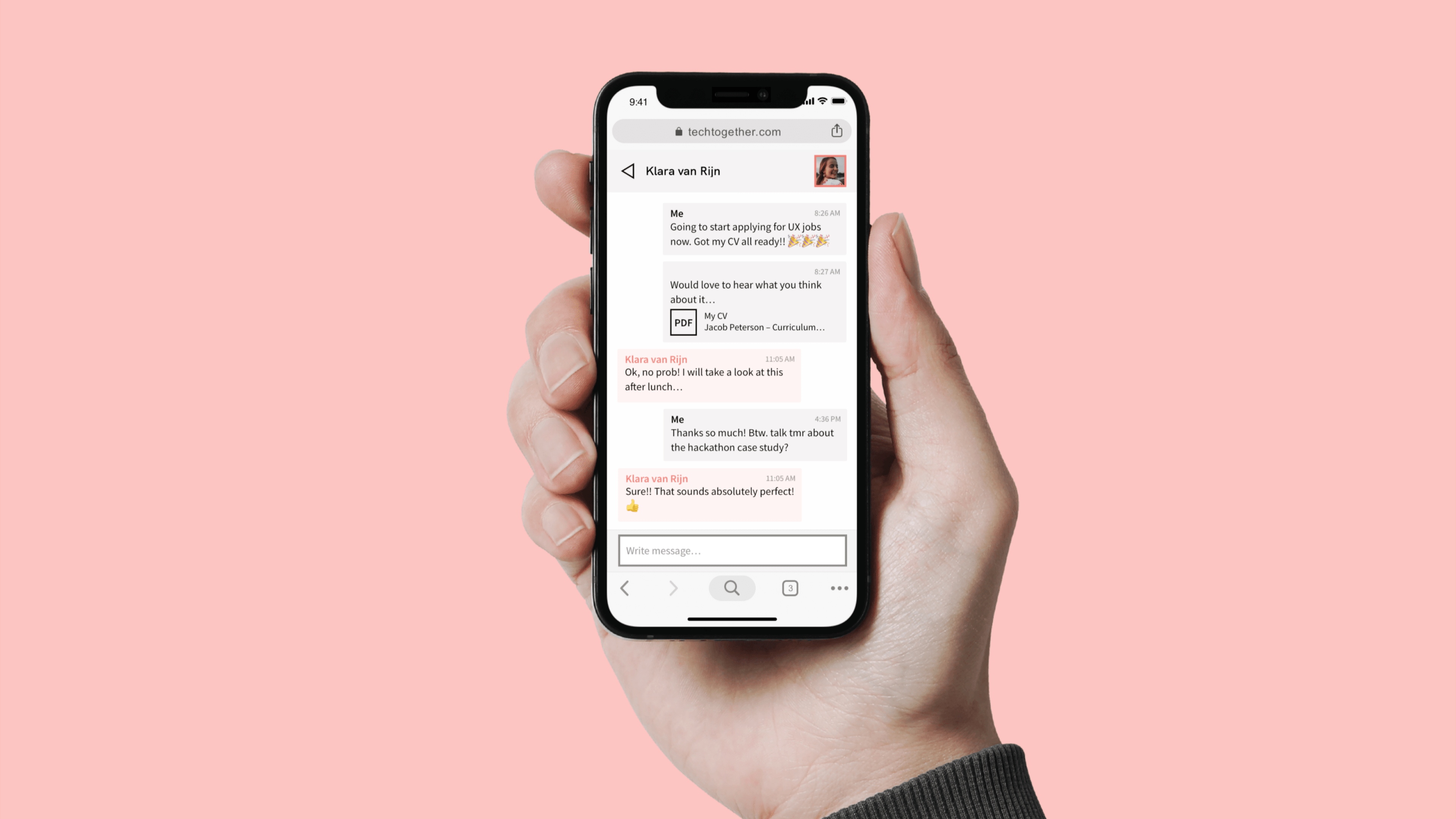


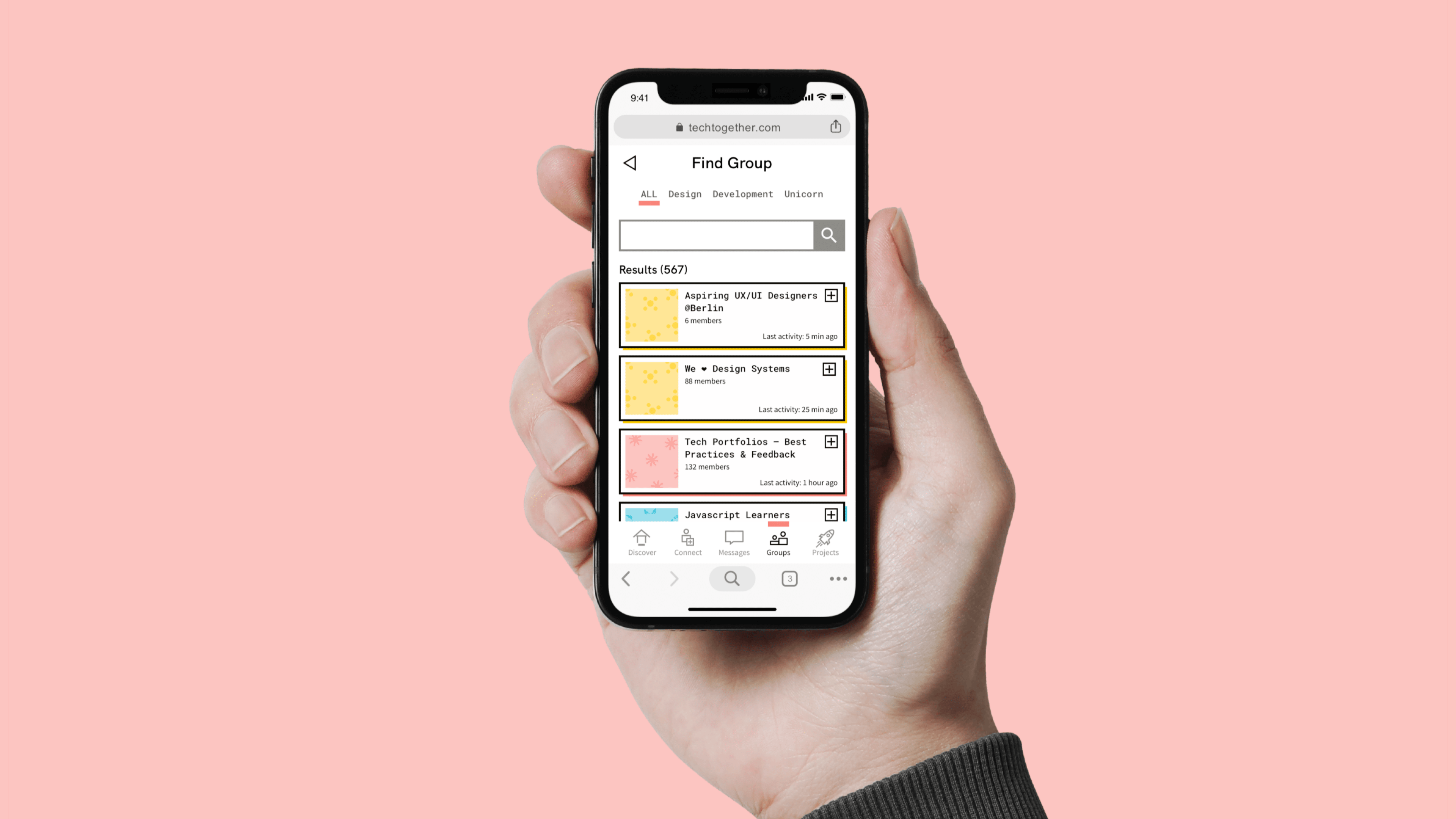

Tech_Together was a fun project that helped me to re-fine my UI skills in the context of an idea that could solve a problem that I have encountered myself: Getting first-hand, cross-disciplinary experience while starting out in the field of digital design. If I had more time for this project, I would definitely invested it into both qualitative and quantitative user research to avoid the common trap of relying too much on my own personal experiences instead of real data from users. While the user research provided by CareerFoundry helped to create a general understanding of the users' needs, its user persona (a student enrolled in an online course) did not fully represent the target groups I decided to focus on in the end. Next time, I'd like to plan in more time for the UX side of the project to make sure that all efforts of designing a functional and desirable interface will be in service of building a successful product.
Ready for more?
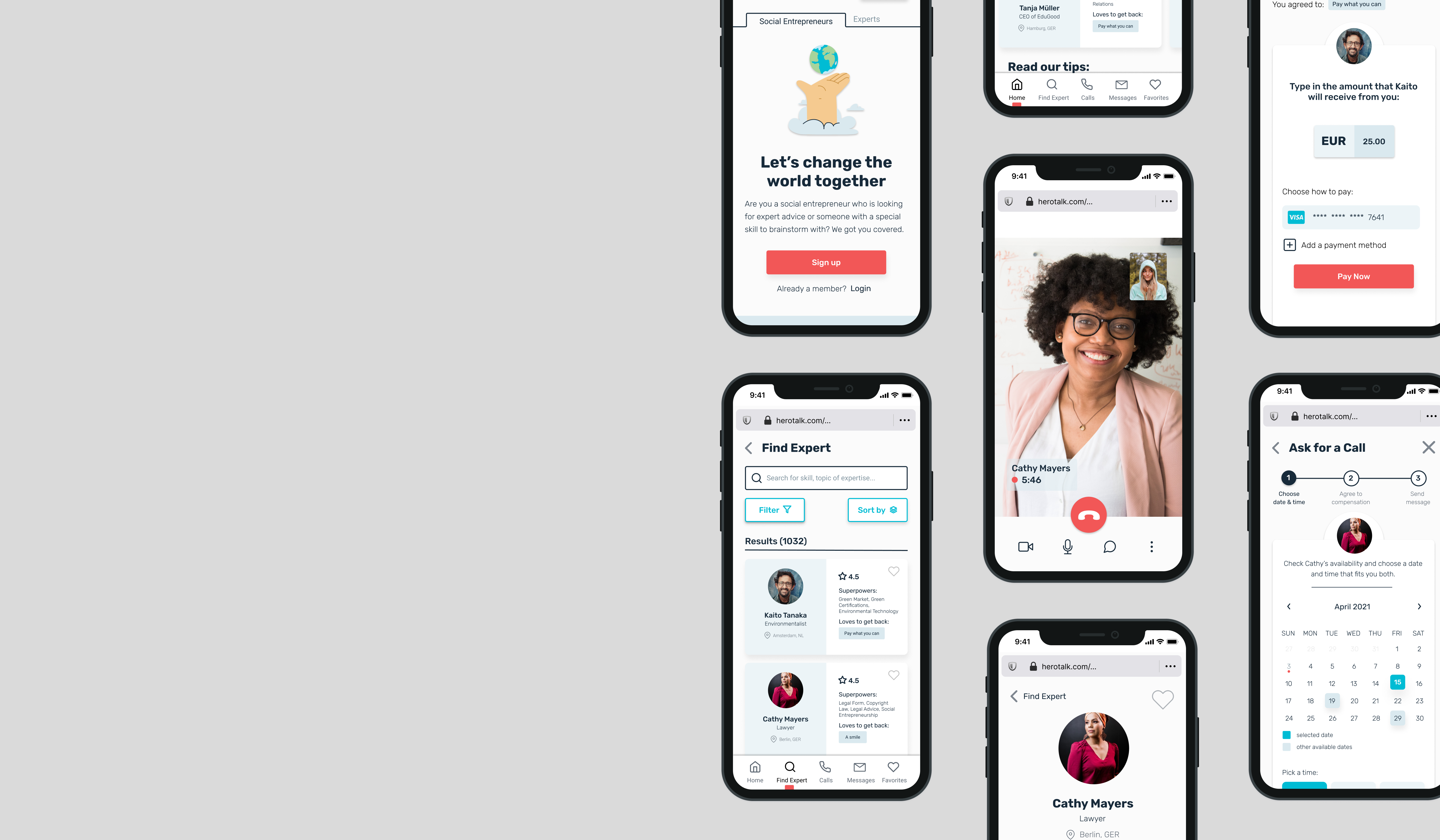
HeroTalkUX Research, UX Design, UI Design